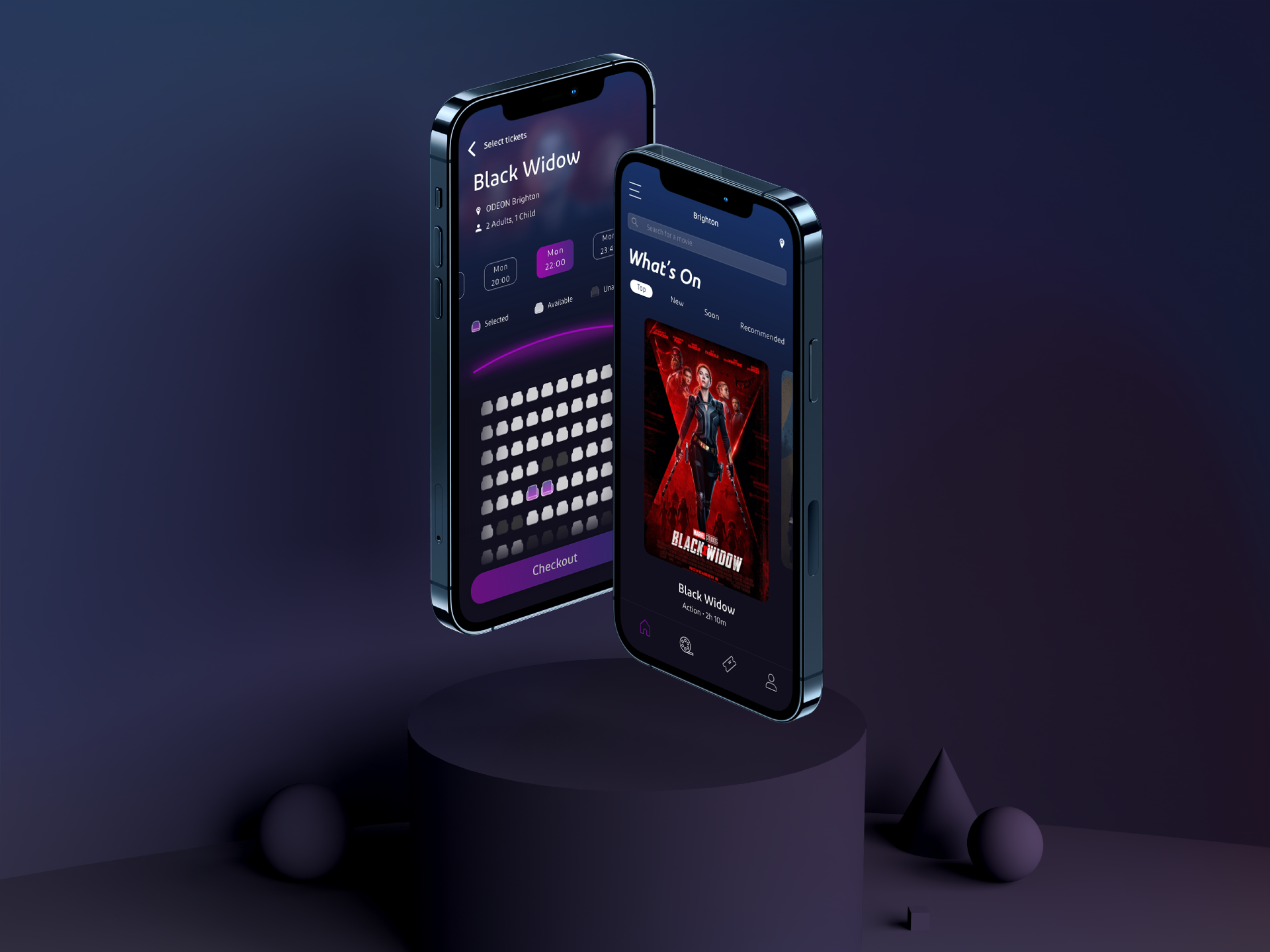
This project aims to tackle usability issues that the Odeon app currently presents. This was done by evaluating the existing system and creating a new design that enhances the user experience.
More and more entertainment companies are offering mobile apps to make the whole booking experience more pleasant, hence it is very important to present an enjoyable experience prior to the actual movie experience.

Although most cinemas in the UK offer mobile apps, Odeon does not include an e-ticket option which is one of the key features that make the whole user experience easier. Not only missing features, but also the overall design seems to be very generic and dated and does not enhance the user experience at all.
The goal was to combine usability, aesthetics and entertainment in one app and create a memorable, virtual pre-experience prior to the movie experience.
Qualitative & Quantitative Research, UX Design, UI Design, Prototyping and Testing
Adobe Xd, Adobe InDesign, Google Forms, Sketching tools
The process for this project was the Interface and Information Design process which includes Research, Ideation, Design and Testing.
In order to get a better understanding of the product and the target audience, the first step in this process was Research and Evaluation. This includes defining a project objective:
After this, the target audience was analysed and some evaluation goals have been set prior to the evaluation process, which are based on the 5Es of usability:
Efficient - Can users find the information they need to complete tasks without assistance? Can users perform a process within a predetermined timeframe?
Effective - Can users successfully place an order or sign up for a service?
Engaging - Do users rate their experience as satisfying or enjoyable? Do their comments (and body language) suggest that they are having a positive experience?
Error tolerant - Do users experience errors? If so, how many? And when they experience errors, do they recover successfully? If they receive error messages, do they understand them?
Easy to learn - Can users get started right away? Does their ability to do tasks improve as they become familiar with the system? Does the system architecture match their mental model for the way they expect the system to work?
Some evaluation techniques have been reviewed and in order to collect more accurate data, both qualitative and quantitative methods have been used in this usability testing which consists of:
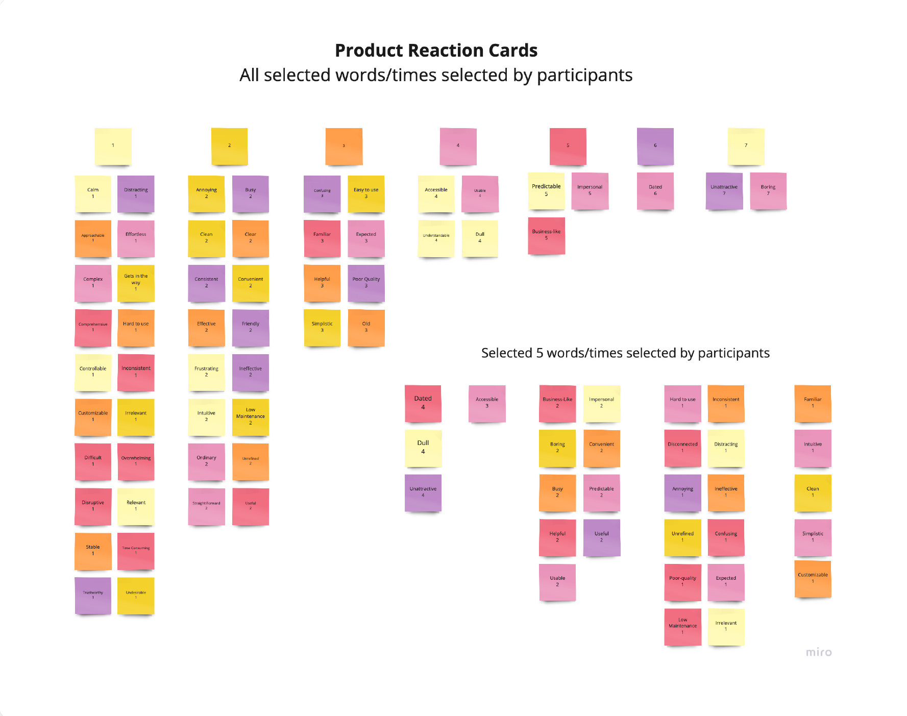
The surveys showed that in overall, the app is functional and useful, however, it is not perceived as an attractive app with a good user experience. Three principles have been used that were developed through user insights and project objectives. The product had to be:
Attractive
When interviewing users, many of them pointed out that the app
seems to be very unattractive and not aesthetically pleasing. The
goal was to achieve a design that is modern yet fits the Odeon
branding theme.
Clear
Another defined pain point was that users found the app confusing while doing tasks. This can be achieved with the implementation of clear, intuitive design elements.
Innovative
While interviewing potential users, it was apparent that most of
them found the app to be dull and boring. Since it is a cinema
app, it has to be an innovative, exciting app that enhances the
user’s experience prior to the cinema experience.
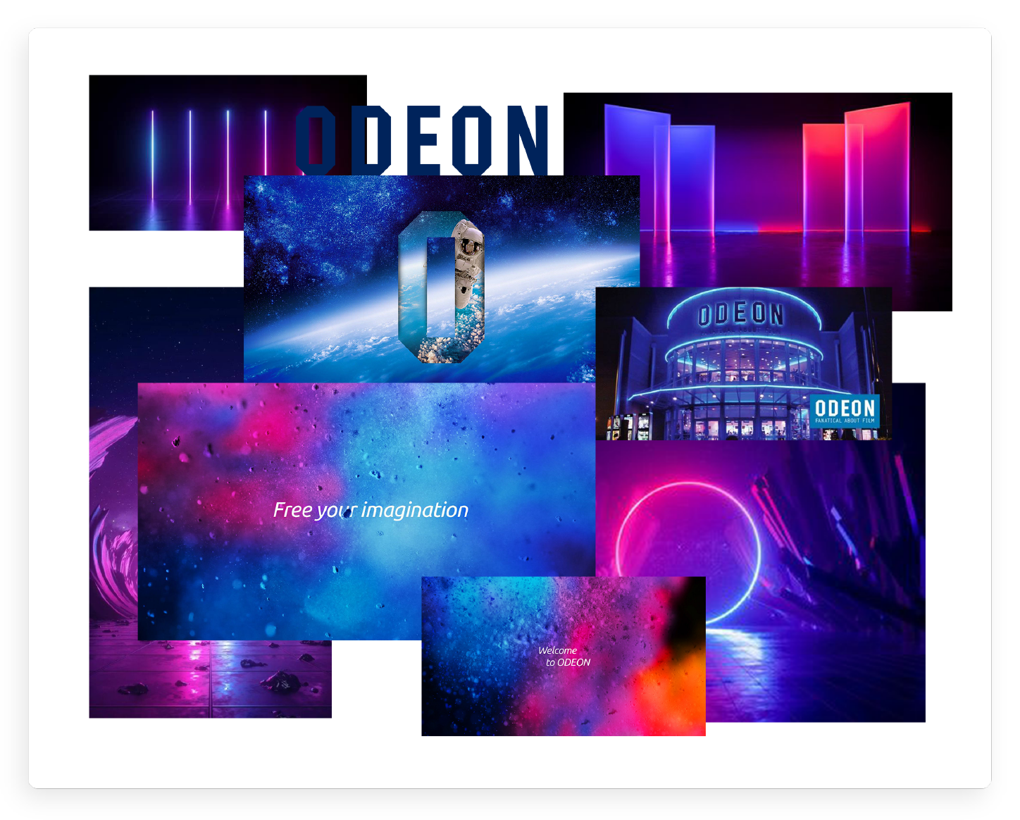
First mood boards were designed to build on the existing branding and improve it further by adding modern design elements.
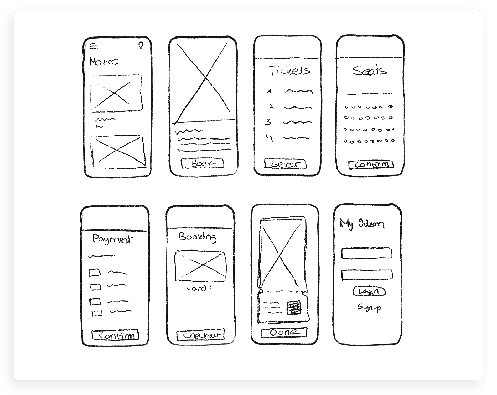
Lo-Fi Prototypes
Before starting with the design process, some sketches have been done in order to discover different solutions and to detail out the flows.
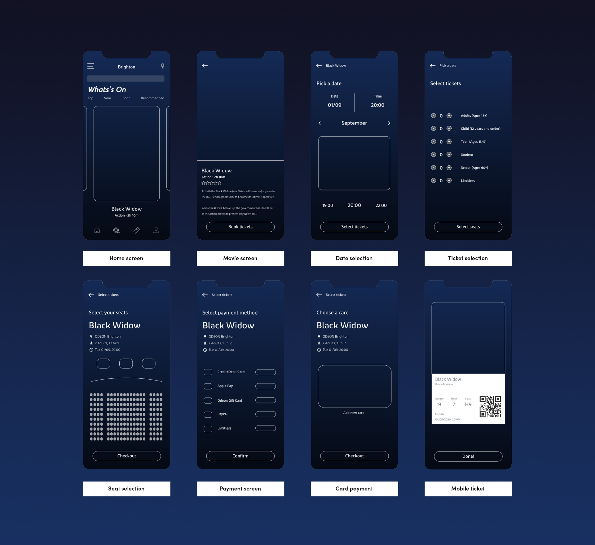
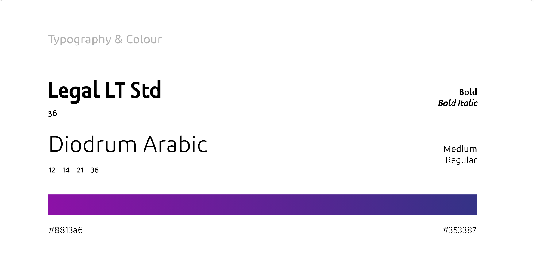
With this step, the foundation for the design process has been laid. The colour theme and the font styles have bene adjusted to the current Odeon branding.
Splash and Onboarding
When opening the app, the user will land on the home screen and only needs to sign up or register when booking a movie. The navigation bar consists of four options:
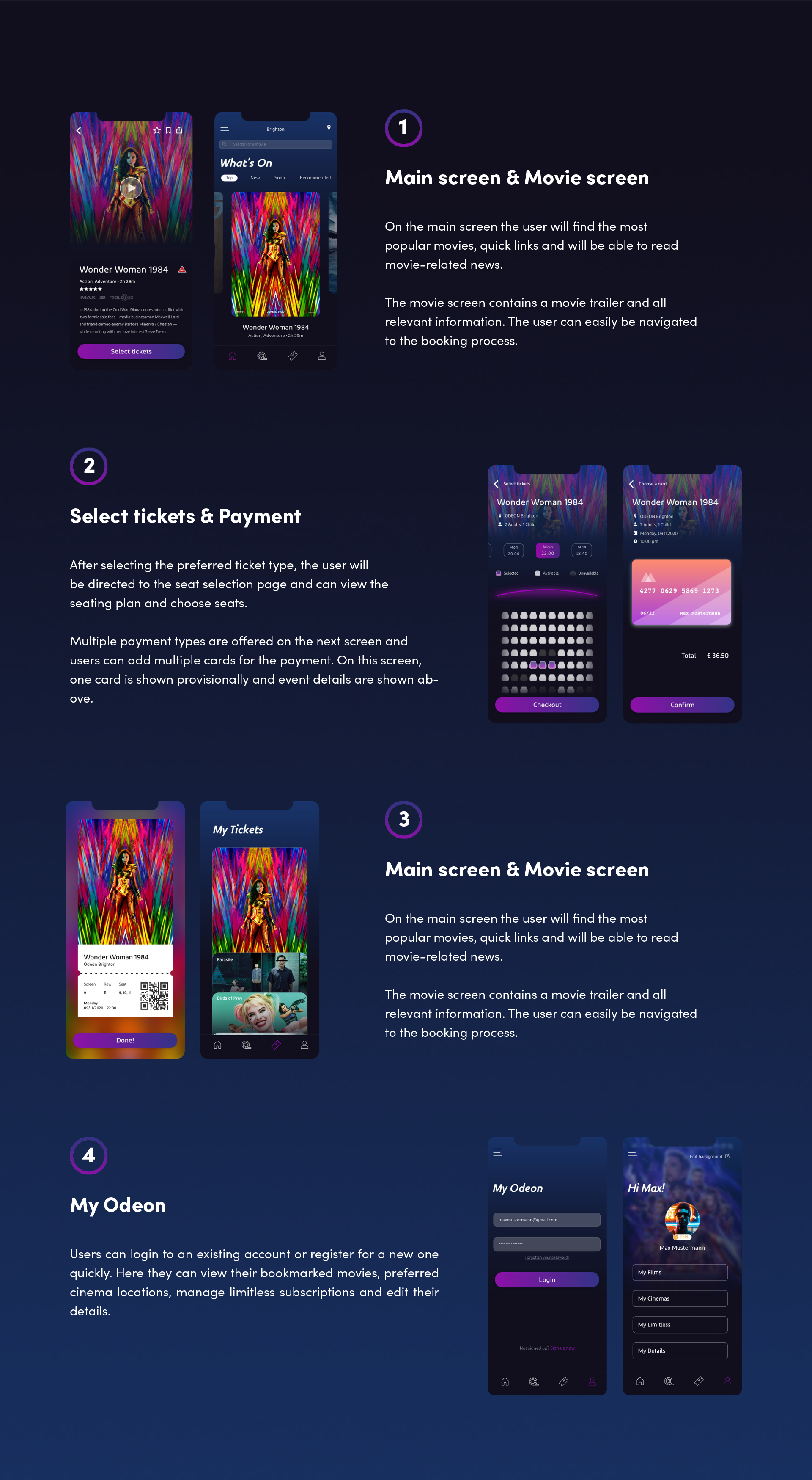
After completing the hi-fi prototypes, they have been sent for user testing with the previously used methods. The results were more than satisfying and the overall score of the product usability was excellent. According to the user insights, the goal of achieving an attractive, clear and innovative mobile app was achieved.